Detecting positive cells
Tips for setting cutoff thresholds to determine positive cells to match visual estimates
A common use of QuPath is to detect and count positive cells in brightfield images, typically with hematoxylin and DAB staining.
This post describes some of the tools and tricks that can be used to help with this task.
Detecting positive cells
The main command used to both detect & score cells in QuPath is Analyze → Cell analysis → Positive cell detection:
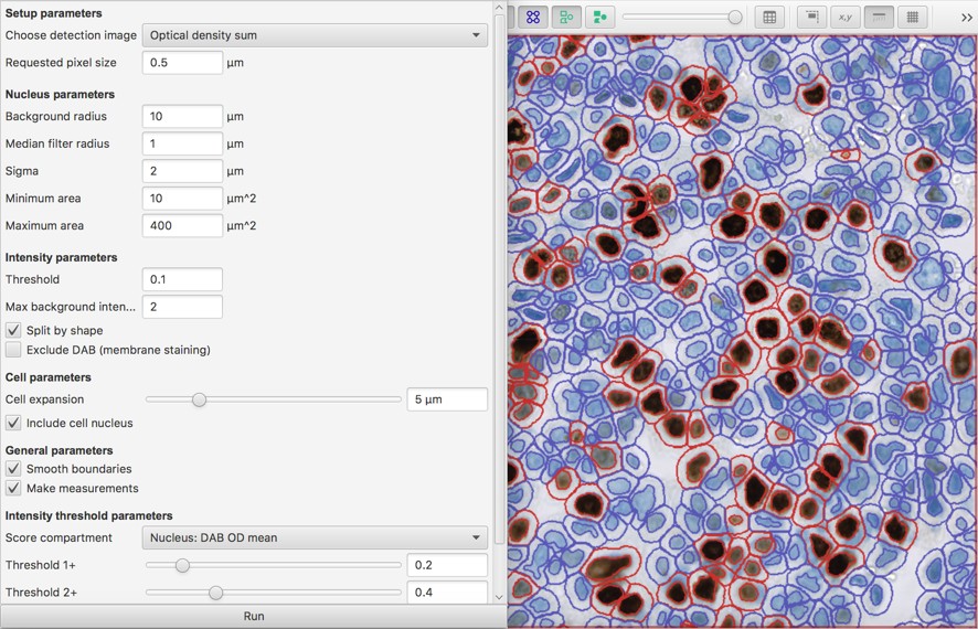
The key parameters related to intensity scoring are
- the score compartment (nucleus, cytoplasm, cell [which is nucleus + cytoplasm])
- the measurement to make in that compartment (mean, maximum)
- the threshold(s) to apply to the measurements
The following describes an approach to decide on the first two of these:
- If the staining is in the nucleus - or obscures the nucleus - choose Nucleus: DAB OD mean
- If the staining is quite homogeneous and localized around the nucleus, keep the Cell expansion value low and use Cytoplasm: DAB OD mean
- If the staining is quite punctate or diffuse, consider using Cytoplasm: DAB OD max or Cell: DAB OD mean
In choosing between mean and maximum, I loosely think of it this way:
- choosing the mean indicates ‘the staining should be found throughout in the cell compartment’, whereas
- choosing the maximum indicates ‘the staining should be found somewhere in the cell compartment.’
The maximum is a less robust measurement, and more easily thrown off by artefacts or staining from neighboring cells. So if there is no compelling reason to use it, the mean is probably best.
Potentially, the minimum might be used to indicate ‘the staining should be found everywhere in the cell compartment’… but generally it isn’t.
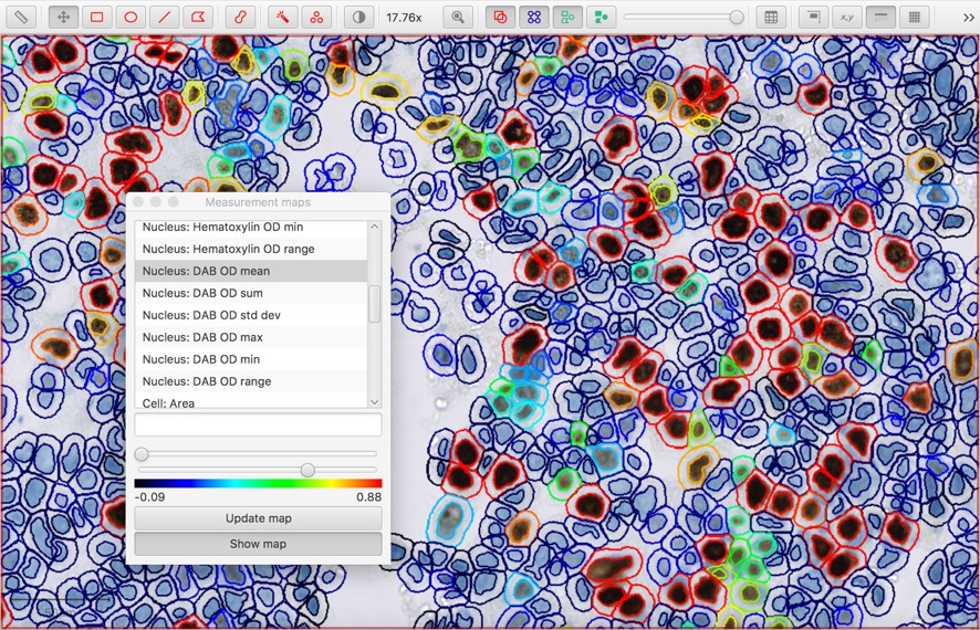
Visualizing thresholds
In the end, any cutoff thresholds need to be checked visually for reasonableness.
One way to visualize measurements in context is via Measure → Show measurement maps. This gives a color-coded representation of each cell where the color depends on the measurement value:
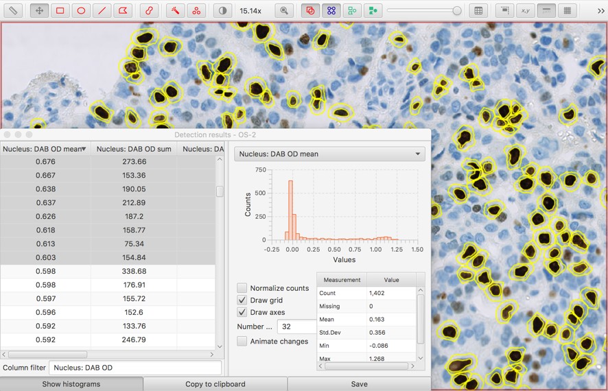
An alternative is to use Measure → Show detection measurements to create a full measurement table. Since the table can be quite large, a filter box at the bottom is provided to start typing the name of the column you might want. Histograms can also be shown to see a distribution of each measurement across all the cells.
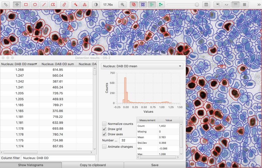
The measurement table can be especially helpful if it is sorted according to a potentially-interesting measurement (by clicking the column header).
Then, rows can be selected to highlight the corresponding cell - and the value of the measurement indicates the threshold required to detect it.
In fact, it can be useful to hide all the cells (e.g. by typing h with the image viewer in focus, or pressing the green button on the toolbar) and then start selecting rows of the table, beginning at the top. As more rows are selected, the corresponding cells light up. This gives a way to very quickly see what would be detected with each potential threshold.
Having determined an appropriate threshold, one option is to re-run the Positive cell detection with the appropriate value.
However, a much faster way is to run a one-line script:
setCellIntensityClassifications('Nucleus: DAB OD mean', 0.4)
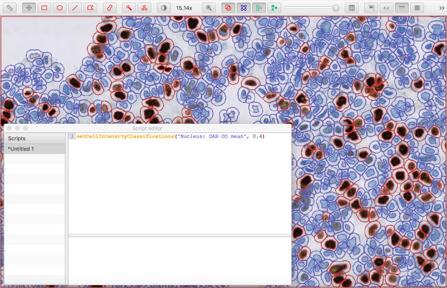
The measurement name and threshold value can be modified as necessary.
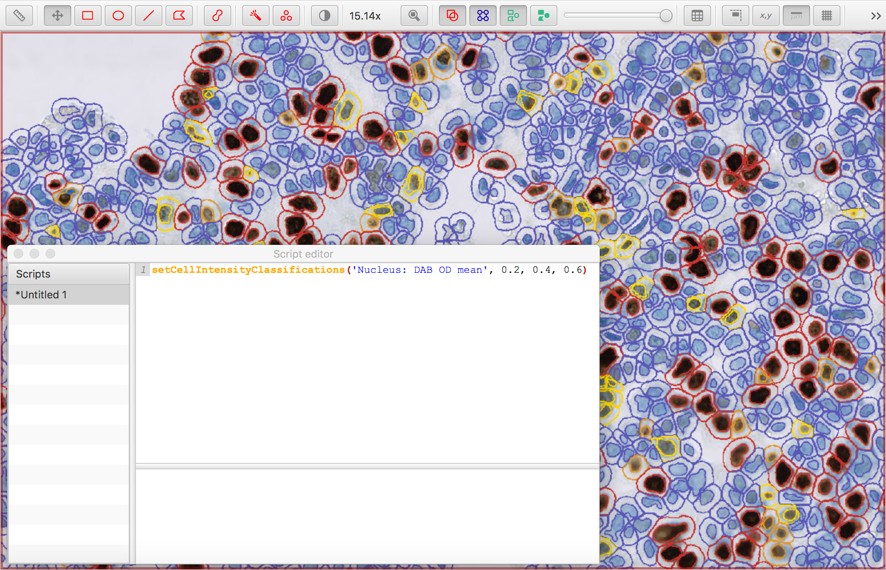
It’s also possible to add up to three thresholds, to subclassify cells as negative, weak (1+), moderate (2+) or strong (3+):
setCellIntensityClassifications('Nucleus: DAB OD mean', 0.2, 0.4, 0.6)
I’d be very interested in how other people approach this task, and what other techniques could or should be used.
If you’ve an opinion you’re willing to share, please leave a comment below.